מכון דעות
עקבו אחרינו ברשת
Select your language

")
- פרטים
-
 מחבר.ת אסף הלחמי
 - כניסות: 43
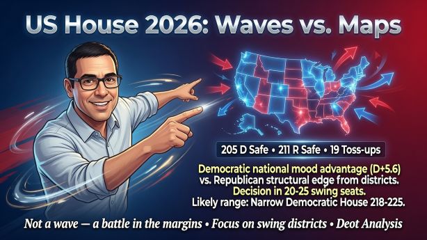
נכון ל־2 ביולי 2026, אם מקלפים את רעש הכותרות, הקרב על בית הנבחרים האמריקני בנובמבר 2026 נראה כרגע כמו מאבק בין שני כוחות מנוגדים: יתרון ארצי לדמוקרטים בדעת הקהל מול יתרון מבני לרפובליקנים הנובע מסידורי גבולות המחוז החדשים, איכות מועמדים ומקצב התכנסות הנתונים עד הסתיו. השאלה הגדולה איננה רק "מי מוביל", אלא איזה סוג יתרון מתורגם בפועל למושבים.
נכון לסוף יוני 2026, 270toWin מציג 205 מושבים דמוקרטיים "מובטחים", 211 רפובליקניים "בטוחים" ו-19 מתנדנדים; כלומר הכרעה בשוליים, לא במרכז.
המרחב הסביר של התוצאה לבית הנבחרים 2026 נמצא בין בית רפובליקני צר לבית דמוקרטי צר-בינוני, כאשר מרכז הכובד הנוכחי נוטה לדמוקרטים - אך ללא הכרעה מבנית. ההמלצה - לעבוד תרחישית עם טווח 218-225 לדמוקרטים כבסיס, תוך שמירה על תרחיש קצה של שימור בית רפובליקנית.
🔴 זהו הכיוון הסביר ביותר, ולמה - נכון לעכשיו, העבודה האנליטית הנכונה היא על בסיס בית-נבחרים נוטה לדמוקרטי אך לא מוכרע. מצב הרוח הארצי עובד לטובת הדמוקרטים, אך תרגומו למושבים עדיין תלוי במפות, במועמדים ובקצב התכנסות הנתונים עד הסתיו. לכן, המלצה אחת לקובעי מדיניות: לא לבנות תכנון על "גל", אלא על 20-25 מחוזות מכריעים בלבד.
- פרטים
-
 מחבר.ת superman
 - כניסות: 454
- פרטים
-
מחבר.ת superman
- כניסות: 412
- פרטים
-
מחבר.ת superman
- כניסות: 380
Typography
Documentation and examples for Bootstrap typography, including global settings, headings, body text, lists, and more.
h1. Heading 1
h2. Heading 2
h3. Heading 3
h4. Heading 4
h5. Heading 5
h6. Heading 6
Display 1
Display 2
Display 3
Display 4
Display 5
Display 6
This is a lead paragraph. It stands out from regular paragraphs.
You can use the mark tag to highlight text.
This line of text is meant to be treated as deleted text.
This line of text is meant to be treated as no longer accurate.
This line of text is meant to be treated as an addition to the document.
This line of text will render as underlined.
This line of text is meant to be treated as fine print.
This line rendered as bold text.
This line rendered as italicized text.
Alerts
Provide contextual feedback messages for typical user actions with the handful of available and flexible alert messages.
Badge
Documentation and examples for badges, our small count and labeling component.
Example heading New
Example heading New
Example heading New
Example heading New
Example heading New
Example heading New
Example heading New
Example heading New
Buttons
Use Bootstrap’s custom button styles for actions in forms, dialogs, and more with support for multiple sizes, states, and more.
Card
Bootstrap’s cards provide a flexible and extensible content container with multiple variants and options.
Card title
Some quick example text to build on the card title and make up the bulk of the card's content.
Go somewhereCard title
This is a wider card with supporting text below as a natural lead-in to additional content. This content is a little bit longer.
Last updated 3 mins ago
Card styles
Cards include various options for customizing their backgrounds, borders, and color.
Primary card title
Some quick example text to build on the card title and make up the bulk of the card's content.
Secondary card title
Some quick example text to build on the card title and make up the bulk of the card's content.
Success card title
Some quick example text to build on the card title and make up the bulk of the card's content.
Danger card title
Some quick example text to build on the card title and make up the bulk of the card's content.
Warning card title
Some quick example text to build on the card title and make up the bulk of the card's content.
Info card title
Some quick example text to build on the card title and make up the bulk of the card's content.
Light card title
Some quick example text to build on the card title and make up the bulk of the card's content.
Dark card title
Some quick example text to build on the card title and make up the bulk of the card's content.
Progress
Documentation and examples for using Bootstrap custom progress bars featuring support for stacked bars, animated backgrounds, and text labels.
Spinners
Indicate the loading state of a component or page with Bootstrap spinners, built entirely with HTML, CSS, and no JavaScript.
Pagination
Documentation and examples for showing pagination to indicate a series of related content exists across multiple pages.
תוכן נפוץ (תגיות)
המלצת העורכ.ת

Data Mesh - לפרק את צוואר הבקבוק של ה-Data לפני שהוא מפרק את העסק
- ינו 26, 2026
- 235


תחזית מדינית-ביטחונית - עדכון
- יונ 21, 2026
- 51